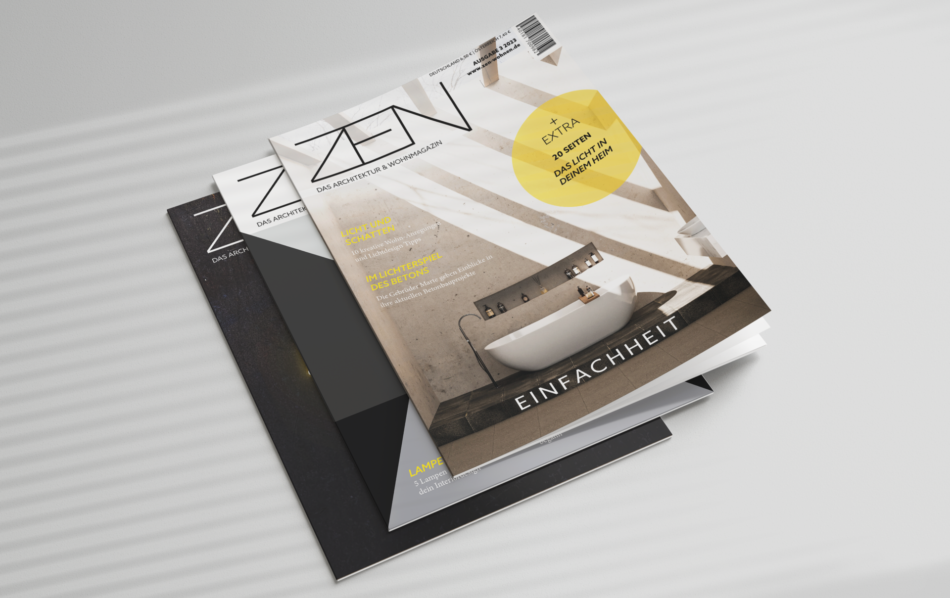
Zen Home Magazin
Editorial Design • Magazine Cover
The stylish ZEN home magazine offers creative living ideas with beautiful photos. Furthermore, it provides living reports, lifestyle reports, and practical tips from interior designers.
A brief explanation of the editorial design process is presented below. The interplay of image, color, and font choice, has conveyed a consistently modern yet timeless effect.
Cover topic: Simplicity
Photographic Design
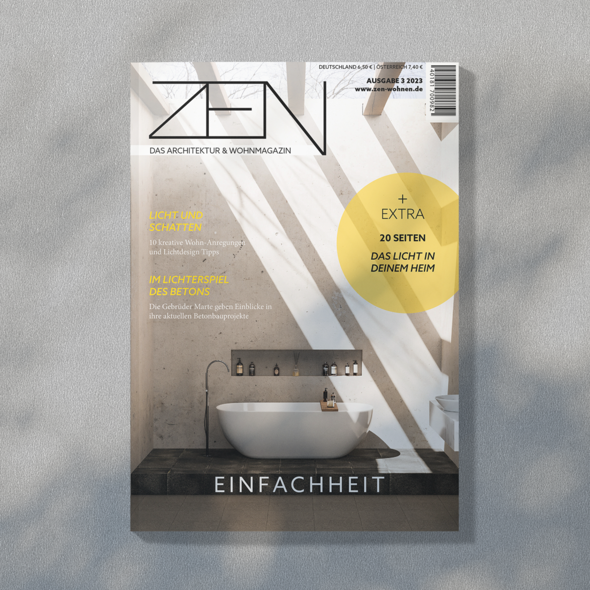
The choice of images, colors, and fonts should combine to convey a modern and timeless effect. In the case of this magazine cover, this is also visible through the chosen picture, among other things. The predominantly sans-serif fonts also emphasize the modern style.
Illustrative Design
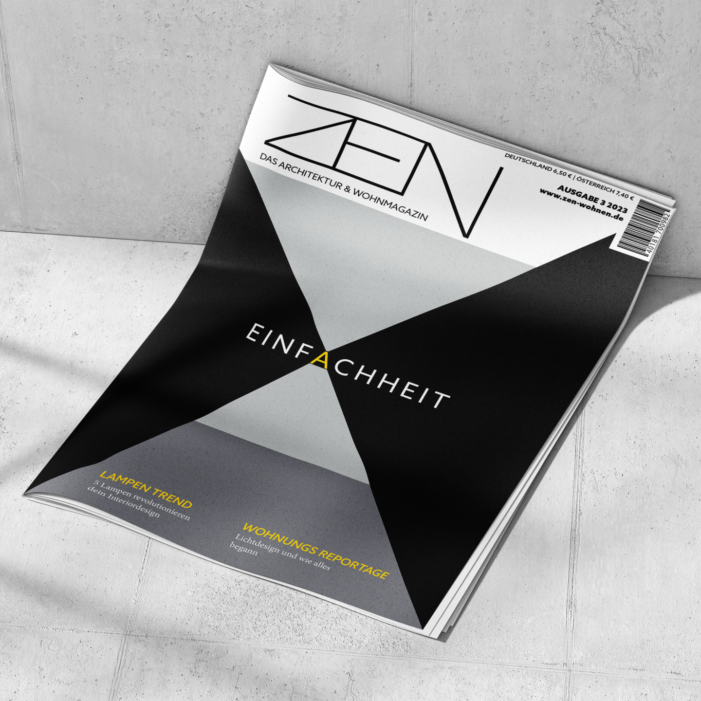
The used grotesque font also introduces a modern style in the illustrative magazine cover. Additionally, the modern style is supported by the use of abstract minimalist forms.
Typographic Design
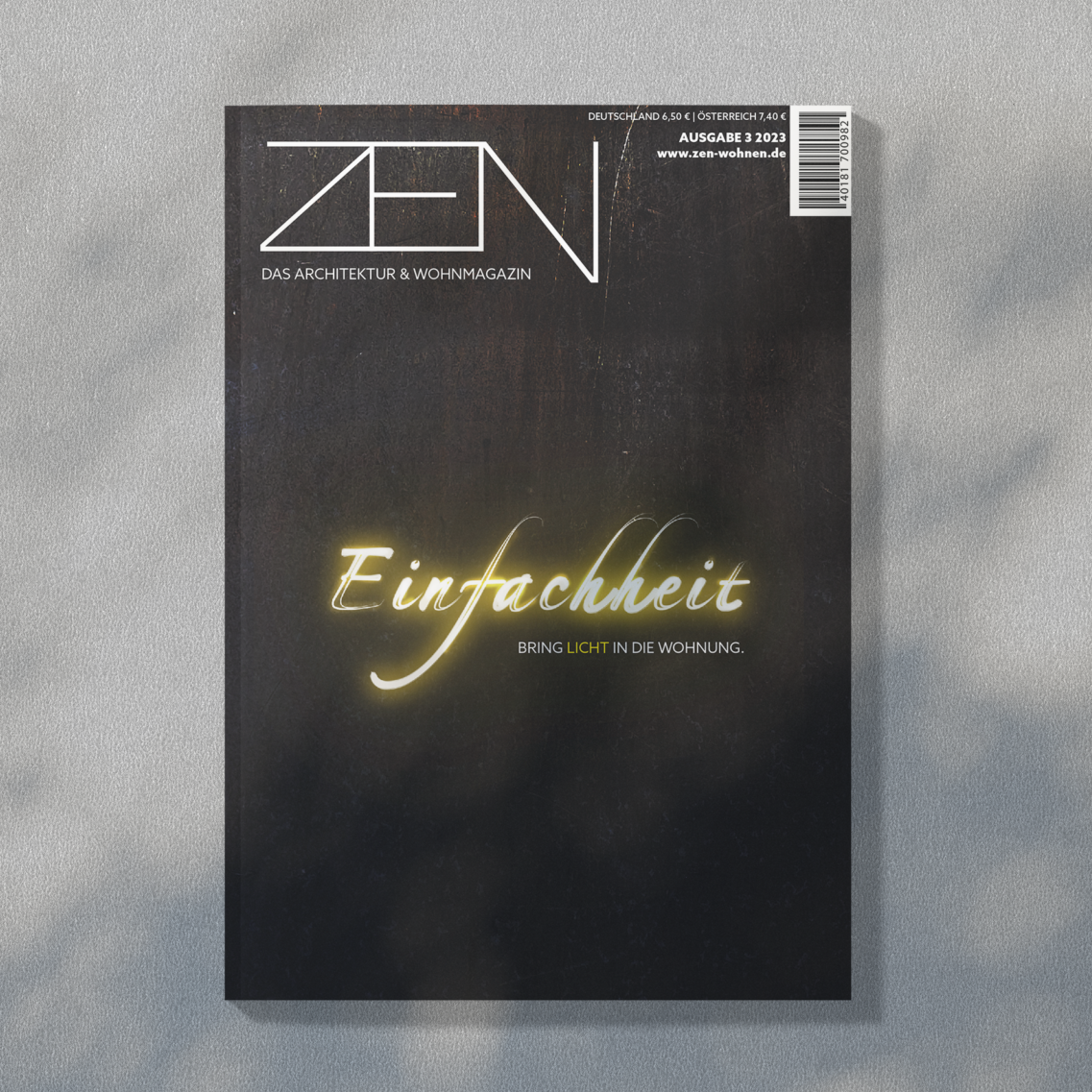
The word “simplicity” on the typographic magazine cover is presented in the decorative script font Rollerscript. In this case, the font itself is the design. Due to the dark background and the applied light effects, the typeface appears like a light painting. This effect gives the whole cover a more modern and relaxed look.