Aim & Challenge
Higher reach through customized branding
Guidelines
Corporate color pink remains
Sun and water graphic remains
Solution
Redesign of the companys logo
Recherche
This part was largely left out as ideas for the new logo already existed. I was already gripped by a creative drive when I took on the job.
Initial situation
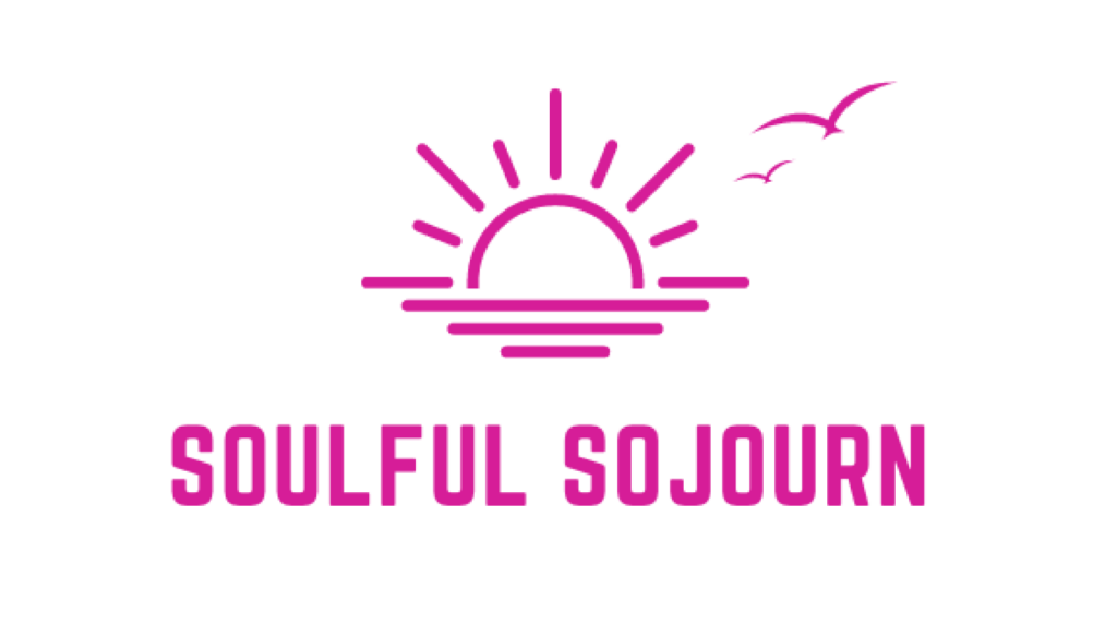
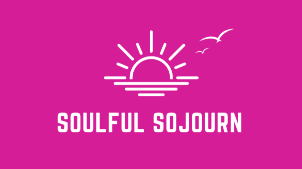
Previous Logo
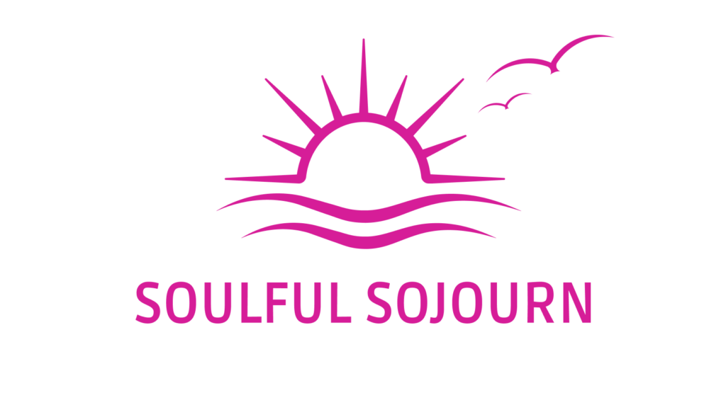
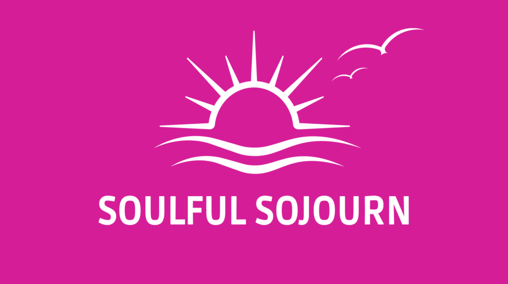
New Logo
As you can see, mainly I edited the curves of the graphic (strokes and corners).
I did this because thin fine lines and pointed edges add a graceful look, the whole logo looks finer and conveys a more sophisticated look, which presents a high-quality brand.
Explanation of my design decisions
Revision of the graphic parts
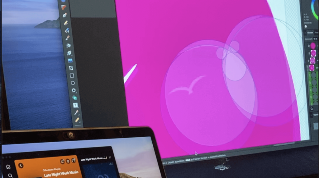
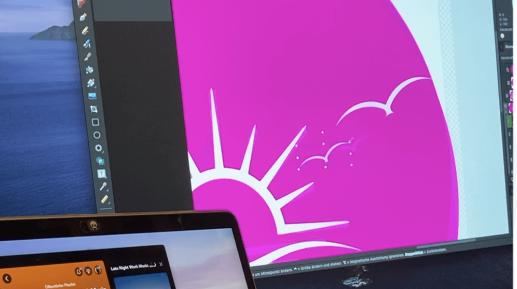
In addition, I designed wave-shaped alternatives instead of the previous simplified “line” waves. The viewer will now establish a faster connection to nature and relaxation through the waveform.
This reflects the agency’s values and goals.
Adjusting the font
Changing the font was also part of the redesign.
As the entire image now consisted of finer lines, there was a break in style with the font used for the company name.
The new font (right) now appears in the same style as the logo. For better readability, thick font style was used and the text appears in capital letters.
Finalization
Handover of the final design
The logo redesign was successfully handed over to Soulful Sojourn.
You can currently see the logo as a profile picture on their Instagram account: soulful_sojo

